Research: Janine’s Graubaum’s ‘Kosmos Train’

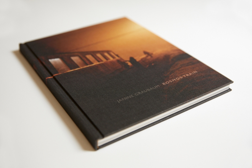
‘Kosmos Train’ is a photo essay that documents the day to day in Eastern Europe railways. It is a really powerful document that through candid shots captures how is the experience of travelling in these Soviet-era trains. It could be understood as a similar work to N. Ackermann’s ‘Looking for Lenin’, arguably they both document the remnants of a past era in former communist countries. However, this work is more about contemporary life that has barely changed, as the scenario it happens in (the outdated trains and stations) hasn’t either. As it is described in the introduction to the essay in Berlin Quarterly’s Sixth Issue, these trains are like a time capsule.

69A39564
The book’s cover

The work is mainly composed of candid images that depict everyday situations in the trains or the platforms. What makes the essay conceptually deeper is the inclusion of images such as the obsolete equipment in the train stations or the old fashioned waiting rooms, or little details such as an old Red Army hat. These photographs contribute to the feeling that we are watching documents of the past, even though they were taken between 2013 and 2015.

The visual style makes the photographs more authentic. There’s a certain blurriness in many of the images that tell us that this is not staged, Graubaum was shooting handheld and without auxiliary lighting, making the human subject unaware and the sensation of being there more powerful. Nonetheless, this doesn’t mean that the composition is lousy. The author plays with the spontaneity, the narrow depth of field and the slower shutter speeds to use the dark areas and the out of focus objects as compositional elements to balance the images. The composition is particularly remarkable in the interior shots without human presence, they are more abstract and their juxtaposition with deep (compositionally) and shaky images makes them stand out and confers a contemplative side to the series.

The use of the available light is really important as well. Many of these images were taken at night time and the author uses the interplay between darkness and different types of light to create images with different levels. In one of the photographs, a woman sits peacefully at her home’s entrance lit by a yellow lightbulb while outside a dog half lit by that same light and half in the dusk gloom looks at the camera, and in the background a freight train car waits in the shadows. These makes the image’s meaning more complex as the light adds meaning to each of these elements. In general, the use of the available light sets a melancholic and mysterious mood for the whole series that works really well with the subject.

Research: ‘Looking for Lenin’, by Niels Ackerman

‘Looking for Lenin’ is a documentary work with photographs by Niels Ackerman and texts by Sebastien Gobert. They searched for some of the thousands of disgraced Lenin statues in Ukraine after the government’s ban on all symbols of communist past in 2015, following the aftermath of the Euromaidan revolution.

Looking for Lenin_COVER.jpg
The book’s cover. Published by FUEL. 

As other works focused on symbols of the Soviet era this work is highly symbolical. But what sets this work apart is its investigative effort and the visual approach of the images. Ackerman chose to show the statues or their remains as they found them. This results in images with a certain irony on them, something that emphasises the sense of decadence of past symbols.

The relationship between space and subject is really important as well, working with the symbolism. Many statues were found in dumpsters, in neglected buildings or in storage spaces, they are usually relegated to a small space within the frame, as if the author was communicating how these fallen symbols are perhaps no longer of much importance in the new order established after the 2014 revolution, even though many people still try to preserve them. As the authors say, the fate this statues suffered says a lot about the polarised situation in current Ukraine.

The use of available light works together with the author’s will to photograph the statues as they are found. There is surrealism in these images but it’s balanced by the lighting, which avoids the viewer thinking the photographs were staged. The use of light is a good example on how documentary practice can use available light and composition to make creative but realistic images.

Research: Sato Shintaro’s ‘Night Lights’

This work by Japanese photographer Sato Shintaro is a series of colourful night photographs of the streets of Tokyo and Osaka.

What makes this work special is its different approach to a rather frequent subject, such as nocturnal scenes of a huge city. The first thing Shintaro does is putting the focus on a less known area of this cities. In his own words, instead of going for the more “pleasant locations” he chooses the “disorder of the streets”. This includes adult entertainment districts, with their neon lights and characteristic signage, elements that are essential to make this work different and significant.

As Shintaro says, he wanted to show the thing itself, the streets, thus removing the people from the images is the natural choice. The attention goes to the colours, the signs, the lights and the visual rhythm they create as a whole. The framing and the composition are paramount, since the author wants to show that rhythm, and he succeeds to do it.

The images are flooding with visual elements and the viewer can feel the disorder and the overpopulation, but they images have a certain visual logic. The signs are there for a practical reason rather than aesthetic, the shop owners need their business to stand out. But seen from Shintaro’s perspective, one can see the beauty, indeed involuntary, within the visual chaos.

Of course, there’s other effects from the decision of removing the people. The technical choice Shintaro made, using long exposures, has a few consequences. The first effect is obvious, amazingly well lit street scenes. At the same time, any person that would come for a second into the frame would just fade. And then there’s the movement. Those objects that appear blurred work together with the absence of human presence and the flood of light to create a spooky feeling, almost like if we were seeing a parallel ghost-world.

For all those reasons this work is a great example of what the subversion of expectations can do for documentary photography. This eerily bright and colourful photographs allow us to see the real subject, the cities, from a new perspective. From what could be seen an aesthetic decision, this images manage to free the viewer of preconceptions so he can look with fresh eyes, probably Shintaro’s biggest achievement.


Research: Maciej Dakowicz’s ‘Cardiff after dark’

This photography series documents the Cardiff weekend night life from what could be considered a street photography approach. However, they shouldn’t just be seen as a bunch of night street shots put together but as a deep document of British lifestyle.

What makes this work great as series is the fact that these images don’t only show drunk Welsh people on compromising situations but that they are an in-depth portrait of society. By showing us their pursue of fun and pleasure, that may be understood as escape, the photographer is showing us his subjects out of inhibitions, thus sincere although violent and exaggerated too.

Nevertheless, Dakowicz doesn’t want to fall into mockery. It doesn’t seem that these images are making fun of their subjects. There is humour, but the photographs feel close to these people, as the photographer was when he took them. There is, of course, a certain distance, as he is an external view and is not (as) drunk. But there’s not a condescending view, rather a respectful one, given the circumstances.

The situations documented and specially the way they are captured are probably the most important component of this images. The moments the author chooses to capture (and show) are so revealing, often framing several people in a shot and comprising into it a wide range of behaviours and emotions, a natural product of alcohol and other drugs induced estates.

The compositions are magistral, even reminding of Velázquez paintings. With many subjects within the frame, each one doing something different, the images don’t ever feel overstuffed thanks to the intelligent framing and composition, making them complex and funny. There’s often a main subject that takes the main of the attention but their relationship to the surroundings is important too.

The photographs have a poetic component, normally caused by scenes of camaraderie, violence or sordidness. But some pictures depict more quiet scenes that show us a different perspective of the subject. There’s a photograph of a couple hugging surrounded by purple light, that is a rather delicate and even minimalistic image that stands out within the whirlwind.

Another important element on this images is the use colour. By their look, they are taken with available light. City lights, either warm or cold ones, transmit a particular look and mood that work together in this photographs with phone screens, colourful outfits, fast food wrappings or neon lights to create motley light combinations with vivid colours, as colourful and varied as the scenes captured.

Finally, it is also noticeable that, with a few exceptions including indoor scenes, the photographer chooses to work in well lit main streets. This, that could be understood as a practical choice (more available light allows the faster shutter speeds necessary for these images), offers us another insight on the nature of this work. This is not a backstreet document, what Dakowicz is showing us isn’t a hidden aspect of society, it is before our very eyes every weekend, his biggest merit is in making the viewer look deeply into it

Research: Bernd and Hilla Becher

In contrast to Sally Mann’s work, which places light and its properties as a main element, (perhaps giving it more importance than to what the subject may be) the Bechers have taken a completely different path that, however, is still rooted in the same idea: the opposition of mysterious and layered light against crisp and all revealing light.

Pitheads 1974 by Bernd Becher and Hilla Becher 1931-2007, 1934-2015
© Estate of Bernd Becher & Hilla Becher

The work of this german couple could be considered as the epitome of typographic photography. Focusing the most of their career on documenting industrial structures all around Europe and America, their best known images are black and white large format photographs taken from a straight frontal angle with practically the same light conditions over the years. The images are controlled to the minimal detail, aiming to document the world in the most precise way possible, perhaps what Sally Mann would call “forensic documents”.

Their approach to light is quite distinctive, once they’ve decided everything else they would then wait for the right conditions. This would involve “the precise mix of sunshine and clouds to ensure the largely neutral background”, as Susanna Lange indicates on her analysis of the Becher work in the book ‘Basic Forms‘. This, of course, contributes to focus the attention on the structures, placing them all against the same background strongly emphasises differences and similarities.

In addition, light in overcast days is very soft, it doesn’t create strong shadows and therefore produces a subject very well lit in a general sense, without big contrasts. When looking at the Bechers’ work one immediately perceives its all-revealing and crisp quality, that owes as much to the author’s eye for the subject as well as to their choice of light.

The result are monumental photographs of objects pretty much overlooked in the fine art realm before the Bechers put a focus on them. They are documents of an age that is never coming back but they are works of art on their own right too. Isolated and in black and white, this structures have become a symbol of 20th century art. The grid-disposition in which they are usually presented, normally showcasing the same type of structure over and over again, is deeply connected to photography’s nature as an archival medium (discussed by D. Campany on his review of T. Ruff’s JPEGs series) and to the vast majority of 20th century’s art movements. The power of juxtaposition, when done right, is very easily understood when looking at this work.

Research: Sally Mann

Sally Mann’s work in general and her Souther Landscapes in particular are a great example of how light behaviour can be captured in photography. Black and white large format photographs using traditional capture and developing methods, they are really evocative and transmit the layered quality of southern light she talks about.

She links her work to a layering of reality, understanding photography as a medium that creates many layers of truth that can be read individually. Her images are studies of light that happen to be landscapes or portraits. Her approach helps the viewer appreciate the photographs in an abstract way, focusing the gaze in the light and its behaviour as well as its interaction with the elements in the frame. It’s easy to see in her work the visualisation of her philosophy on photography, the compositions are an interplay of light, shadow and texture, allowing many different reads, not only aesthetic but conceptual. When seeing her photographs one not only thinks on how light is in the Southern United States but linking to its gothic tradition and how different the life of the people there is.

Her monumental work ‘What Remains’ faces death and physical decadence exploring different subjects, offering different views of the same theme, deepening its understanding. It is a great instance of conceptual unity and depth, using a shared visual approach to each of the series that compose ‘What Remains’, each one a work on its own but working together towards a deeper and confrontational look into death as a continuing process rather than a destiny. Her images seem to be more focused on transmitting that in what Mann would call “forensic documents”, the viewer doesn’t just see death but feels it and somehow faces it. That’s thanks to the nuanced and subtle choice and treatment of subjects. The ancient battlefields could be just simple landscapes for other photographers but Mann’s camera sees them as what they are, makes us see what they really are.

Research: ‘American Photographs’ by Walker Evans

Considered a touchstone of the photo book as an work of art on itself, ‘American Photographs’ is composed of photograph’s taken by Walker Evans from 1929 to 1936 in the Eastern United States. The images, as the original MoMA exposition, are divided into two main sections, the first one containing a portrait of the Americans, studying both their social context and the individuals themselves, whereas the second one is focused on the American cultural expression through different forms.

2017-12-28 17.08.35
From the sleeve of the 75th Anniversary 2012 Edition, by Museum of Modern Art.

There’s a clear purpose to this recommendation. The sequential viewing in an order given is a way of creating a connection between successive images, through accumulation and repetition of motifs and visual elements it transcends the necessity of a coherent or linear narrative, creating instead a collective meaning.

Each image stands on its own but their meaning is amplified by the photographs that precede and follow them. For instance, the last two images of the first part (the first one a man sleeping in the street and the second one a fallen tree before a neglected plantation house in Louisiana) are good images on their own but placed one after the other they create a deeper understanding of the times Evans documented. Late 20s and early 30s were indubitably turbulent years for the United States (being 1929 the start date for the Great Depression) and Evans’ photographs are a great document of it. The two photographs mentioned previously are collectively a symbol of the poverty, apathy and decadence of the time.

Analysing Evans’ visual ability, it’s easy to see his mastery of the framing. Helped by the use of large format, his images are windows to his America, when looking at them the viewer doesn’t see a cropping, whatever is inside the frame has its own entity. As Szarkowski stated, good framing creates by cropping objects of real life shapes in the photograph that are independent of what they originally belonged to.

Moreover, there’s a quality to Evans’ work that places himself apart from contemporaries such as Cartier-Bresson. While Evans documents streets in many of his images, he doesn’t belong to the street photography tradition, his photographs are contemplative, not dramatic at all. Specially his interiors, so symbolic, are product of an inherently paused look. Also, due to its collective presentation, ‘American Photographs’ can be considered a precursor of the current artistic-documentary perspective, that relies more in the series than in the single photograph and dismisses the “decisive moment” in order to document better contemporary times.


Research: Thierry Girard

Thierry Girard is a French contemporary photographer that has been documenting China for a good part of his career. He has created two main bodies of work that carry a discovery “as much internal as geographical”, as he himself says.

As S. Howarth and S. McLaren say in their book ‘Street Photography Now’, the most prominent characteristic of his approach is that it’s a chronicle rather than a criticism or a romanticisation, he plants his tripod and simply documents how the changing social, economical and political circumstances influence the everyday life of the everyday person.

Girard tends to work with medium format cameras, a technical choice that implies much more than a particular aspect ratio. For their nature, medium format cameras usually require the use of a tripod. Girard always uses one, carefully composing each image and waiting for all the right elements to be in place, “I wait for the people to appear like actors on a stage”, he explains.

Using medium format can give a photograph an undistorted quality non achievable with classic formats. Girard’s images are wide as well as neatly composed and framed, and they transmit a certain sense of anti-snapshotness, like an Ansel Adams large format landscape, and at the same time they have an undeniable “decisive moment” quality. Girard’s images would be the proof to Szarkowski‘s statement: “the thing that happens at the decisive moment is not a dramatic climax but a visual one”. His photographs don’t depict dramatic scenes, while everything within the frame is perfectly placed what really gives depth to them is the purity of the look, the feeling of an unadulterated view of China’s day to day in a fast changing society.

And this is what I consider Girard’s biggest lesson, how, through the creation of a perfect visual landscape from an urban stage, he creates a clear window to what he’s documenting, making the viewer feel he’s within the scene and therefore empowering the transmission of the story, not a story with an exciting ending, but rather a chronicle of a day in the life. Something much more related to what contemporary tends to be.

An urban landscape with a huge road full of bike riders, a crossroad where a man smokes sitting next to his bike or an underground entry with a classic Chinese building faded by the pollution in the background, all these are great instances of transmission trough visual elements. They show exactly what is the country’s current situation, with its mix of pollution, raising capitalism and a tradition that resists to fade, but they’re not jumping into the viewer’s face, they are just there.

Research point: ‘L’amour tout court’ documentary

‘L’amour tout court’ is a documentary film directed by Raphaël O’Byrne. It focuses on photographer Henri Cartier-Bresson’s photographic production and artistic perspective and is completed with the testimony and study of authors from different artistic disciplines such as painting, music or cinema that are related to Cartier-Bresson in one way or the other. Basically, the premise of the film is a study of the artist’s view. Starting from the rather revolutionary (in its time) and influential opinions of Cartier-Bresson to then move the lens to some inmates of a Georgian prison in a photography workshop or to artist Avigdor Arikha.

Obviously, as a photography student it was Cartier-Bresson’s statements that I focused more my attention at. One of the first things he talks about is the photographer’s gaze: “What’s important is to look, but people don’t look, 75% of the people just press the button”, it’s an announcement to really take into account to understand photography’s role in society, perhaps specially in today’s society. “The gaze that pierces the meaning of this, this and this… few have it”, says then, what makes yourself consider if your photography is really piercing anything or it can’t go further from the surface of things.

Related to this, seeing the sequence of the workshop in the Georgian prison is kind of heartbreaking but really enlightening. When Sluban teaches the inmates about the existence of a photographic language one of them understands it really fast: “he wants our pictures to have meaning”. Then it shows us the process of the inmates taking the photographs and seeing them, something that takes me to my childhood memories about photography, that excitement about having your picture taken, the mystery of not knowing what was captured into the negative, emotions that the omnipresence of digital photography has turned into much more nuanced feeling. When an inmate asks Sluban if he can keep a camera because his mother is coming to visit and he wants to take her picture really makes you think if you revere photography enough.

Possibly the most important statement Cartier-Bresson does is about the importance of luck in photography. He says that “luck is all that counts”, something that could be misleading if it wasn’t for his previous affirmation that shooting without actually looking will take you anywhere. What I believe he’s trying to say is that one should be ready for luck to make your photograph great, he even says that “photography demands extreme concentration”, when he says “if you’re open it’ll come” he’s talking about the importance of having a trained eye that recognises geometry intuitively and being completely involved in the picture making so as if you’re lucky enough that combination of concentration, attentive gaze and luck will render the perfect photograph.


Research: time in photography

Long exposure techniques explore the fascinating relationship between time and photography. How a single frame can encapsulate extended time and what is its meaning? Here I’ll explore the work of three different artists that started from the same technique but have arrived at very different places. As with practically any other formal technique, long exposures can yield many different conceptual results, as many as different subjects and perspectives are.

Hiroshi Sugimoto, Japanese artist based in New York, depicts in his photographs American movie theatres for the duration of the whole projection. He uses a large format camera and no auxiliary light, just the light coming from the projector. The result of thess few hour exposures are quite monumental, like watching roman ruins. The screen is a big rectangle of intense white light while the theatres appear empty, somehow the public disappears. As Sugimoto says, the images are a depiction of emptiness, with the theatre acting as a case for that nothingness. The author also sees this project as an opposition to the philosophy of cinema, as an art that brings “dead reality” (photographs) back to life trough succession, while this project condenses all the frames of a film in just a single one and consequently, stops again the motion of cinema, a name that comes precisely from kinema, Greek for motion.

Hugh McCabe is an Irish photographer that uses large format and long exposures as well. He mainly depicts music concerts, with exposures ranging from 2 or 3 minutes to about 20, he keeps his shutter open for the length of an entire song.  The subject, even though it is a “show” as well, changes substantially the character of these photographs, this isn’t photography of photography (cinematography) anymore, that meta quality doesn’t exist in this images. Instead, they are an exploration of the essence of performers. A quick Google search with the “concert photography” words shows that this genre is clearly focused in capturing a “decisive moment”, perhaps in detriment of capturing the aforementioned artist’s essence. On the other hand, these images are somehow mysterious but clear reflections of the artist’s nature: some show the performers slightly blurred but still recognisable shape while in others we don’t see the musicians anymore, they’ve moved some much during the song that they’ve barely been burned into the negative.

Michael Wesely is the best known artist I’m introducing in this text. Featured in every ranking of the “longest exposures ever made” you could find on the Internet, this German artist has based practically the totality of his career on long exposure photography, from a few minute portraits to 3 or 4 year exposures. Wesely builds his own cameras (except the lenses) and uses neutral filters and the smallest apertures to achieve his images. He’s perfected his method so much that he claims he could make decades long exposures if necessary. But this extreme technique isn’t just a formal achievement, it allows Wesely to “shift photography’s perception”, in his own works. His most famous work is perhaps the documentation of architectural demolishment and reconstruction, spanning years. Those images are depictions of the flow of time and of the change of daily lives, framed by the lines in the sky that show how the Earth moves around the sun through the years. Combining all those elements in a same frame, Wesely’s photographs are powerful statements on these matters that still leave space for the viewer’s interpretation.