“Look back at your personal archive of photography and try to find a photograph that could be used to illustrate one of the aesthetic codes discussed in Project 2. Whether or not you had a similar idea when you took the photograph isn’t important; find a photo with a depth of field that ‘fits’ the code you’ve selected. Add the shot to your learning log and include a short caption describing how you’ve re-imagined your photograph”.
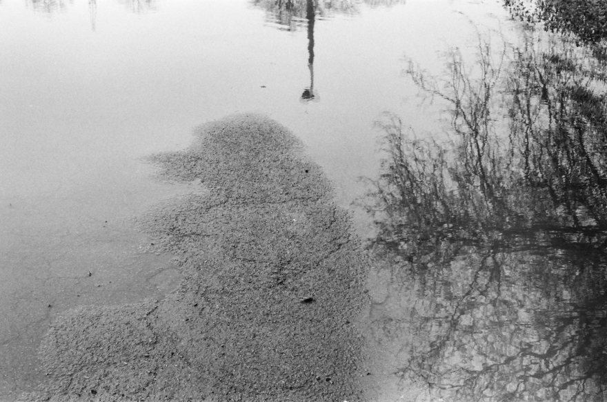
Platt Fields Park (Manchester), March 2017
I think this image can be linked to the idea of shallow depth of field used to achieve a memory-reverie sensation. I put the focus on the pavement while using a wide aperture, so the trees and the light reflected on the water were out of focus. I think that the added blurriness of the reflection plus it being upside down emphasises the dreamy feeling that the soft focus already produces.
“Use a combination of small apertures and wide lens to take a number of photographs exploring deep depth of field. Because of the small apertures you’ll be working with slow shutter speeds and may need to use a tripod or rest the camera on a stable surface to prevent ‘camera shake’ at low ISOs. Add one or two unedited sequences, together with relevant shooting data and an indication of your selects, to your learning log”.
ISO 1600, 18mm, f/14, 1/25, aperture priority mode
ISO 1600, 18mm, f/14, 1/50, aperture priority mode
ISO 1600, 18mm, f/14, 1/25, aperture priority mode
Even though we don’t really notice, our eyes don’t see in total depth of focus. It’s just that our brain ignores the parts out of focus to avoid us a headache. Total focus is quite usual today, due to the technical characteristics of many camera phones and average compact cameras.
Unfortunately, not everyone knows how to make a picture actually interesting when everything is in focus. That’s because composition is not taught to kids in school, at least not frequently enough. Social networks are full of pictures that aren’t bad composed, they’re just plainly boring.
In fact, combining short focal lengths and long depths can create really dynamic photographs that can engage better with the viewer. It’s just about knowing to place an element close to the camera and in the right place to balance the composition. For instance, in pictures 1 and 3 the poles in the close foreground make the viewer feel like he’s in the photograph. On the other hand, the puddle in the bottom of picture 2 avoids the photograph to be dull in the bottom half, specially thanks to the reflective properties of water. These strategies, together with other resources such as direction lines are the best way to make wide angle shots interesting.
“Use a combination of wide apertures, long focal lengths and close viewpoints to take a number of photographs with shallow depth of field. (Remember that smaller f numbers mean wider apertures.) Try to compose the out-of-focus parts of the picture together with the main subject. Add one or two unedited sequences, together with relevant shooting data and an indication of your selects, to your learning log”.
ISO 400, 85mm, f/1.8, 1/2500, aperture priority mode
ISO 400, 85mm, f/1.8, 1/2000, aperture priority mode
ISO 400, 85mm, f/1.8, 1/500, aperture priority mode
ISO 400, 85mm, f/1.8, 1/3200, aperture priority mode
When switching from a compact camera to a reflex for the first time it’s always exciting being able to achieve photographs with a really shallow depth of field that look “professional” to our eyes. What we don’t think is that this technical choice is actually a really powerful statement, we’re completely focusing the eye on a really small fraction of the frame and therefore we should be careful about what we’re choosing to focus on. After a while one learns to always focus on the eyes and that placing the focus on the foreground is the easiest way.
However, not many remember that the unfocused parts are still part of our photograph, hence they should be considered when we’re focusing. An element out of focus may not have the same visual weight as one on focus, but they still influence the visual experience.
For example, in photograph 1, two more branches can be perceived blending with the background, they still contribute to the power of the number three in photography while attention is directed to the one and only branch we want to highlight. Meanwhile, in photograph 2 the colour and position of the elements out of focus provide some balance to the composition. And in photograph 4, the chosen point of focus blends together all the elements in the background and creates a rather uniform mass of greyness.
“Find a subject in front of a background with depth. Take a close viewpoint and zoom in; you’ll need to be aware of the minimum focusing distance of your lens. Focus on the subject and take a single shot. Then, without changing the focal length, set the focus to infinity and take a second shot”.
It’s obvious that a photograph’s parts in focus will draw the attention first, it’s like the eye feels more comfortable looking at elements in focus. That’s why it’s so important to choose right what will be in focus and won’t, because it will totally change how the photograph is read and how the viewer understands it.
Putting the focus on the foreground seem more logical and will almost always be the right choice. That’s why leaving elements out of focus in the foreground has to be done with more care, as it’s not as logic we will need to provide a visual reason for it to exist. But this also means it may be more rewarding and produce much more interesting and unconventional results when done right.
Guy Bourdin is a painter and photographer focused in fashion photography. His photographs are characterised by surrealistic narratives where the image is more important than the product.
Bourdin explores the space between the absurd and the sublime, using suggestion and surreal aesthetics. One of the characteristics of his work is the study of the conceptual and graphic possibilities of the printed media. He has tailored his compositions to take advantage to the fullest of the possibilities of the magazine’s double spread format, using resources such as mirror compositions.
Photograph by Guy BourdinPhotograph by Guy Bourdin
His compositions use formal elements to create tension, opposing the inherent reality of the photographic medium with surreal twists and with unorthodox manipulations of the picture plane. His unconventional compositional elements include low skies with high grounds, combined with atypical make-ups, hyper real colours and light and shadow interplay as well as unusual beauty standards.
Some of these elements can be clearly appreciated in the above photographs, making them great examples of how breaking established rules with a clear purpose can contribute to create a highly influential and fresh look into a genre whose artistic and conceptual richness is usually cut off by commercial demands.
This book is Fay Godwin‘s effort to show how the British countryside was changing (for worse). Large areas were torn up for development, rivers and forests were polluted and landowners would deny public access rights to the public.
The photographs depict paths, prohibitive signage wire fences and similar elements. This was an address to the modernisation of the land. By combining through a deep depth of focus the restrictive elements and the extensive landscapes Godwin makes visual the message of caged and spoiled nature she wants to communicate.
Like in the picture below, the juxtaposition of the sheep, the fence and the electric towers in the same frame, with the wire fence in the foreground and everything else behind it but still in focus, transmits a quite obvious feeling of corrupted nature is quite obvious.
From ‘Our Forbidden Land’, Fay Godwin
The author doesn’t include many close-ups in the book. She prefers to focus on large extensions of land, but she doesn’t seem to use wide lenses, it’s more likely that she used medium focal lengths, like if she wants the composition to feel compact and the elements within the frame to be connected to each other. Elements such as trash, signs, fences, roads, fields, paths, trees and animals all blend together in tight compositions that express a sort of suffocation and corruption.
Godwin combines her images with different types of text. While the captions are basic context. There’s also a series of texts that explain the land’s decay (by human hand), relate Godwin’s bad experiences when rambling through these lands, recover her memories of a better past or are poems by other authors. These combination of texts adds up to the photograph’s message and strengthens it.
This work is a great instance of how positive change can be obtained through photography. Through a work with a strong message that is potentiated by it’s photographic qualities and by a smart combination with text, of course.
Founded in 1932, its members included master photographers like Ansel Adams, Imogen Cunningham, Willard Van Dyke or Edward Weston, among others. This collective of highly collaborative authors helped make what was going to become known as “straight photography” the main force in photography for the biggest part of the 20th century.
It was conceived as a reaction against the then dominant pictorialis style’s principles. The founders of the group believe in “pure photography”, a way of embracing photography’s inherent strengths: texture, composition, tonal range and light. Through the use of sharp lenses and extreme depth of field (their name was in fact a reference to the smallest aperture possible in their preferred large format cameras) they intended to achieve total focus throughout the frame.
Their manifesto stated that they would accept “workers who are striving to define photography as an art form by simple and direct presentation trough purely photographic methods. (…) Pure photography does not posses qualities of technique, composition or idea derivative of any other art form”. Therefore, their method would made them into selectors of reality, through their choice of form and framing they would select which part of the world would become a photograph, which is not the same than create a photographic vision of something from the “real world”.
Their most usual subject were landscapes, along with close ups of items from natural environments. These motives would allow them to show creative intuition and ability to create aesthetic order from nature’s apparent chaos. Other subjects were industrial structures, quotidian objects from modern world and nudes.
The vision of the f/64 photographers had of their subjects was what made them relate to each other. Their purpose of translating to the negative exactly what was before their lens was what created the emotional experience of form as the primary feature of their work.
“Find a location with good light for a portrait shot. Place your subject some distance in front of a simple background and select a wide aperture together with a moderately long focal length such as 100mm on a 35mm full-frame camera (about 65mm on a cropped-frame camera). Take a viewpoint about one and a half metres from your subject, allowing you to compose a headshot comfortably within the frame. Focus on the eyes and take the shot”.
It’s pretty obvious why the use of medium telephoto lenses is so popular among portrait photographers. They make the subject look more attractive and the shallow depth of field isolates it from the background and focuses the attention on the eyes (if properly on focus), making an intense portrait.
They’re the right choice if the portrayed is the most important element from the photograph (the great majority of the cases), but sometimes it’s interesting creating some physical context increasing the depth of field. Even if the attention still focuses in the subject, using greater angles of view and including part of the surroundings on focus can make a richer portrait.
“Choose a subject in front of a background with depth. Select your shortest focal length and take a close low viewpoint, below your subject. Find a natural point of focus and take the shot”.
As with the previous exercise, we can see the effects of a close position to the subject combined with a short focal length. This time we add a low viewpoint, that maximises all the previous effects.
The subject looks even bigger and there’s even more sense of depth. As the course notes state, this extreme distortions aren’t the ideal combination for a straight portrait, but it’s still a very expressive effect. That monumentality can be a very interesting characteristic for a portrait shot depending on who the subject is.
“Select your longest focal length and compose a portrait shot fairly tightly within the frame in front of a background with depth. Take one photograph. Then walk towards your subject while zooming out to your shortest focal length. Take care to frame the subject in precisely the same way in the viewfinder and take a second shot”.
It’s kind of shocking to see the effects of different focal lengths in portraits shoots, probably because as it’s a human subject the effect’s are more apparent to us as viewers.
The first picture (taken with a 18mm focal length in a APS-C sensor camera), not only increases the sense of depth of the background (two walls that act as parallel lines) but has an effect in the subject’s features. Even though it fills the same amount of area within the frame it seems to be bigger, probably because the picture had to be taken from a closer position. The facial characteristics are affected too, seem to be maximised, the nose looks bigger and any gesture will appear more exaggerated.
The second portrait (taken with a 55mm focal length in the same camera as the previous one) offers a more neutral view of the subject. The theory states that it favours the subject, as the facial features are presented in subtler way. Since increasing the focal length reduces the depth of focus the background is blurrier, and the feeling of visual depth is lessened due to the closer angle of view of the focal length.
From my point of view, while it’s easier making a decent portrait with a longer focal length it can be really interesting using shorter lengths to achieve really expressive portraits, both from the main subject and from the background’s perspective. Besides, depending on the subject, there may be some facial features that could be really interesting to highlight. As I said in the previous exercise’s reflection, it all depends on knowing to use the right tool for the right subject to achieve the desired effect.


 As with the previous exercise, we can see the effects of a close position to the subject combined with a short focal length. This time we add a low viewpoint, that maximises all the previous effects.

